Logos
Full color
Greyscale, black text
Greyscale, white text
Monotone
Only for use on transit labels and other printed materials where greyscale and full color are not available.
Color Palette
The SWAN color palette is drawn from the colors available through the Material Design system. We use 5 core colors, each of which has a dark and light version to use as accent colors.
We must follow accessibility standards for color contrast when using this palette for text elements, including links, buttons, and other text elements. Color contrast is determined by both the font-size and the contrast between the foreground and background colors.
Primary color
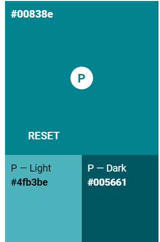
Use the primary color for interface elements containing text, such as buttons and links. This color meets accessibility standards for text on a white background at any font size.
Cyan #00838e
Light: #4fb3be
Dark: #005661
Secondary colors
Use these in addition to the primary color. Some of these colors can be used as text where indicated. Some can only be used for accents or background colors to dark text.
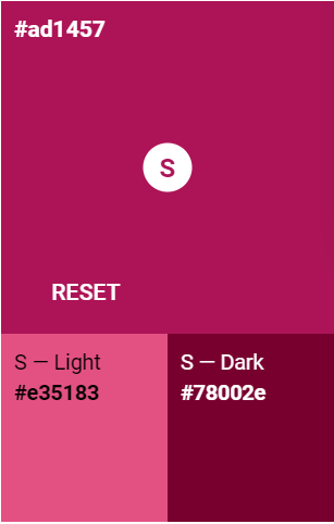
Pink #AD1457
For text, use at any font size and on a white background.
Light: #e35183
Dark: #78002e
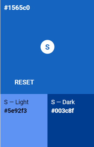
Blue #1565c0
For text, can use at any font size on a white background.
Light: #5e92f3
Dark: #003c8f
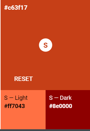
Orange #c63f17
For text, can use at any font size on a white background.
Light: #ff7043
Dark: #8e0000
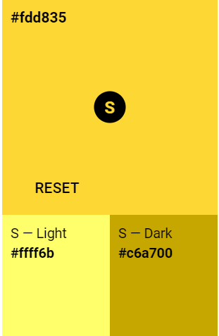
Yellow #fdd835
Use as an accent or background for black text. Do not use as text on a white background.
Body text & gray-scale colors
Body text should generally be dark gray(#666666) or black(#000000) on white for readability.
On web properties, we use a light gray, #f5f5f5, for backgrounds.
Use the Gray 50 palette in Material Design to select additional gray-scale colors for graphics and interfaces.
Status colors
Often we need to represent a status in an interface. The following color pairings are suggestions if you have the option to customize a status. If an interface doesn't allow you to customize the errors and alerts, that is okay - just try to generally follow the suggested color/status pairings.
Red: Error status
- Text on white background: #c62828
- Background with black text: #fbe9e7
Green: Success status
- Text on white background: #2e7d32
- Background with black text: #e8f5e9
Yellow: Warning status
- Background with black text: #fff9c4
Blue: Informative status
- Text on white background: #1976d2
- Background with black text: #b2ebf2
Typography
Primary typefaces
- Source Sans Pro, an open-source sans serif typeface
- Georgia, a widely supported serif font used for some headings
Secondary typefaces
If our primary fonts are not available in a system, you may use:
- Open Sans or Calibri in lieu of Source Sans Pro
- Merriweather in lieu of Georgia
Font stacks
In our web properties, we use the following font stacks:
- Georgia, serif;
- “Source Sans Pro”,-apple-system, BlinkMacSystemFont,“Segoe UI”, “Roboto”, “Oxygen”, “Ubuntu”, “Cantarell”,“Fira Sans”, “Droid Sans”, “Helvetica Neue”, sans-serif;
We attempt to mostly use native system UI fonts on web properties to improve performance and display.
Font pairings & styles
Title(Print Only)
Font: Source Sans Pro, regular or semibold, font-size 5xbody text;
Heading 1 & Web Title
Font: Georgia, regular
This is a heading 2
Font: Georgia, regular
This is a heading 3
Font: Source Sans Pro, bold
This is a heading 4
Font: Source Sans Pro, italic, regular
This is a heading 5
Font: Source Sans Pro, bold
Body text is Source Sans Pro regular at a minimum size of16px.