You will need to have OPAC Administrator permissions to manage your theme.
Getting started
To access the theme administration area:
- Go to Aspen Administration > Theme and Layout > Themes.
- Click Edit next to your library's theme.
Your library is set up with two themes: Default and Dark Mode.
When editing your themes, save often and make one or two changes at a time. You can save using either:
- Save Changes and Return: Use this if you want to finish editing and exit your theme.
- Save Changes and Stay Here: Use this if you want to continue editing
Theme name and settings
Theme Name: Leave set to your library's three-letter code (or xxx Dark Mode)
Display Name: You may change this, but it is recommended to use "Default" for your default theme and "Dark Mode" for your dark mode theme
Extends Theme: Leave as set; your library's default theme should extend the Default theme and your dark mode theme should extend your library's default theme (e.g. xxx)
Make Header & Footer Full Width: Check if you would like your header and footer to extend the full width of the screen up to 1900px wide (recommended)
Make Content Full Width: Check if you would like the page content (such as search results) to extend the full width of the screen up to 1900px wide
- If you check this option, also check Make Header & Footer Full Width
- You can use a full width header without full width content
High Contrast Theme: Leave unchecked
Dark Mode Theme: Check only for a dark mode theme; adds additional improvements for dark mode
Logos and images
After adding images, you may have to do a hard refresh on your catalog page to force a reload of your cover images. To perform a hard refresh:
- On Mac: Command + Shift + 'R' key
- On a PC: Shift + F5
- Or, hold the shift key while clicking the Reload button on your browser.
Logos
To add or edit your logo:
- Under Logo, click Select an Image.
- Select your logo image file and click Open.
- Scroll to the bottom and click Save Changes and Stay Here.
- You should now see your logo at the top of the catalog page and as a preview image in the logo section of the Theme settings.
- To change the logo image, repeat this process and select another file for upload.
Note: The maximum recommended size for a logo image is 750px x 150px. If you plan to display your library name in the header, the maximum recommended size is 250px x 100px. If you want a larger banner image, the maximum recommended size is 1140px x 225px
For crisp images, use .png or .svg files.
Favicon
A favicon is a small icon that appears on the tab in the web browser. A favicon image must be 32px by 32px. Follow the steps above to add an image in the favicon field.
Additional logo fields
You can optionally add your logo to these fields as well
- Footer Image
- Appears at the bottom of your catalog
- Footer Image Link
- Optionally enter your library website URL to make your footer logo link back to your website.
Logo options for the app are under Aspen LiDA.
App header and logos
You can customize your app display under the Aspen LiDA section - you may need to scroll further down the Theme settings page.
Note that logo changes to the app will not display right away - they will populate over time based on the patron's device. To force a reload of the header, you can log out and log back in.
Logo for Aspen LiDA (512 x 512 px)
Displays in the account menu.
Logo to show above the screen title in LiDA (1536x200px)
Displays above all screens in the app, including search results.
- Note that this image does not need to be 1536 pixels wide - it can be smaller but that is the maximum width.
- There is no built in padding in the app header - you may want your app image to include space around the logo to display nicely.
Center Logo Alignment
You can center, left, or right align your logo to that shows above the screen title.
Header Logo Background Color
You can set a color to display behind your logo in the app header.
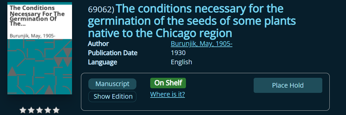
Default cover images
When Aspen cannot find a cover from one of its many sources, it will auto-generate a cover based off of the library's theme with a variety of shapes and lines.
These covers will look something like this:
You can optionally add an image that will occupy the lower half of the default image (title and author will display at the top). In your theme, go to Background Image for Default Covers > Upload an image and save.
Recommended image size is 280px by 280px.
You can set your cover Cover Image Style:
- Shadow/Floating will display a shadow around the image.
- Border / Picture Frame will instead show a small border around the cover image.
Explore More images
If you want to update the icons in the Explore More section of search results:
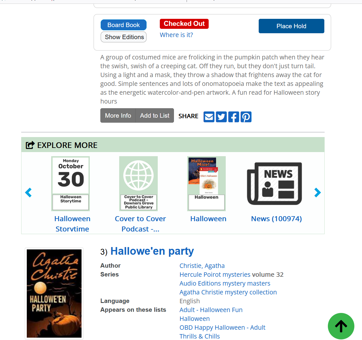
- Go to Explore More Images - you may need to scroll further down the Theme settings page.
- Upload images to any or all fields:
- Library Catalog
- Articles and Databases
- Events (appears only if you have events integrated in Aspen)
- Lists
- Library Website (appears only if you have your library website search results indexed)
- History and Archives (appears only if you have digital archives integrated in Aspen)
Note: You need to upload icons for your dark mode theme separately
Header and footer settings
Make Header & Footer Full Width: At the top of Theme settings, check if you would like your header and footer to extend the full width of the screen (recommended). If you want to upload one large header image, you may want to leave this unchecked.
Adding a header background image
Header background images are optional, and fill the header space behind your logo. In order for this to work, you would ideally need to upload a version of your logo with a transparent background, so the header background can show through. Make sure the colors of your logo will work well with whatever background you choose.
You may need to experiment with the settings to see what looks best, depending on the image you have selected.
Header Background Image:
- Upload an image
- If you want one large, no repeat image, recommended 1200px wide at minimum and 175px high, 72dpi
- Note that very large images may take more time to load, for you and whenever your patrons load the catalog
Header Background Image Fit:
- Cover - the image maintains its aspect ratio, and fills the full dimensions of the header area. This may result in the image being clipped.
- Contain - the image maintains its aspect ratio and displays the full image without clipping, and is resized to fit completely within the header area.
Header Background Image Repeat
- No Repeat - Set if you are using one large background image
- Repeat - Repeats vertically and horizontally
- Repeat X - Repeats horizontally
- Repeat Y - Repeats vertically
Note: You may need to experiment with the settings and/or graphics to best accommodate your design.
Add a footer image
- Navigate to the Footer Image section.
- Select an image: Upload your footer image file.
- Footer Image Link: Add a URL for your footer image to link to, such as your website URL (optional).
- Footer Image Alternative Text: Add alt text
- Save
The maximum recommended size for a footer image is 250px by 150px.
Colors and contrast ratios
There are two ways to change a color in your Aspen theme:
-
Click the color picker and use the sliders to find a color. Use the eyedropper to grab colors from a logo or another image.

OR - Enter the hex code (e.g. #ececec) for the exact color you would like to use.
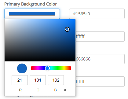
You will notice a Contrast Ratio indicator next to each color picker. This checks the colors you choose with accessibility standards for color contrast.
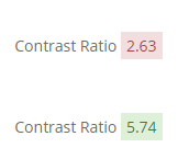
Note: You won't be able to save a theme that fails the contrast ratio check.
If you see a number below 4.5, you will need to change either the background color or the text color before you save. You can also click Use Default to return to the default color settings. The contrast ratio is set to test for WCAG 2.0 AA compliance.
Fonts
To change your fonts:
- Under Heading Font:
- Choose the font you want for page titles, headings, and search result titles from the dropdown menu.
OR - Under Custom Heading Font, click Choose File.
- Upload a TTF, OTF, or WOFF font file if you want to use a custom font.
- Choose the font you want for page titles, headings, and search result titles from the dropdown menu.
- Under Body Font:
- Choose the font you want for page text and search result details.
OR - Under Custom Body Font, click Choose File.
- Upload a TTF, OTF, or WOFF file.
- Choose the font you want for page text and search result details.
Note: We recommend a sans-serif font for body text for readability.
Customize your theme in 5 minutes
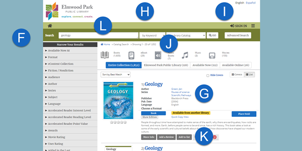
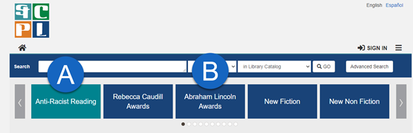
For maximum impact with minimal effort, we recommend updating the following areas:
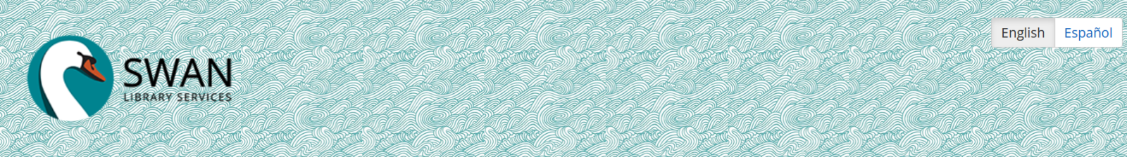
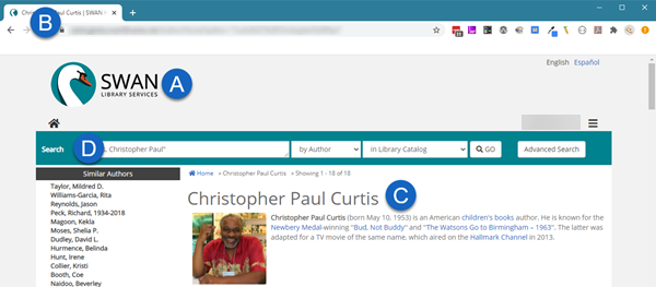
- Logo (A)
- Favicon (B)
- Heading Font (C)
- Primary Background Color (D): The background color for your search bar.
- Primary Text Color (D): The text color on your search bar.
More theme options
You can experiment with many additional theme customization options. We recommend changing one element at a time then viewing in the interface. If you want to dig a little deeper, we recommend looking at:
- Page Background Color (F)
- Link Color (G)
- Link Hover Color (G)
- Result Label Color (G)
- Result Value Color (G)
- Header Background Color (H)
- Header Text Color (I)
- Breadcrumbs Background Color (J)
- Breadcrumbs Text Color (J)
- Search Tools Background Color (K)
- Search Tools Text Color (K)
- Search Tools Border Color (K)
- Menubar (L)
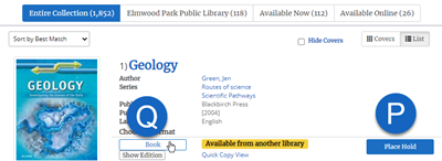
Buttons and home page browse categories
In addition, you can change the colors for buttons and other interface elements. To change the Browse Category colors that appear on your home page:
- Click Browse Categories.
- Select colors for the Selected Browse Category (M).
- Select colors for the Deselected Browse Category (N).
You can also chose to:
- Capitalize Browse Categories if you'd like to force uppercase labels
- Change the Browse Category Image Size to Medium or Large (note some images from Syndetics may appear fuzzy at the large size)
- Set the Browse Category Image Layout to Masonry or Grid Check Use Accessible Layout for a "Netflix-like" carousel display that also offers a better experience for users using a keyboard or assistive device
To change buttons, start with the Primary Button - that will have the most impact.
- Go to Buttons > Primary Button
- Change the Background Color (P)
- Change the Text Color (P)
- Change the Border Color (P)
- Change the Hover Background Color (Q)
- Change the Hover Text Color (Q)
- Change the Hover Border Color (Q)
Note: Setting your Hover Background Color to a shade slightly darker than the Background Color is an easy way to pick a color. You could also swap the text and background colors.
Dark mode and user-selected themes
Aspen provides options to your users to select alternate themes for accessibility, such as a dark theme.
It is strongly recommended not to make any changes to these themes with the exception of updating your logo if needed. You may find an alternate logo design, i.e. using white text instead of black in dark mode, will make the logo more visible.
Users can select their preferred theme under Languages & Display on any page in Aspen. If they are logged in they will be prompted to save their preferred theme, so Aspen will display that theme whenever they are logged in.